No sé que pasa, las últimas entradas desaparecieron luego de una instalación de plataforma, ya pasó hace poco, por suerte solo se trataron de entradas con la programación y no de algún Recomendado, además contamos con los news enviados con el contenido de los post perdidos.
No sabemos cuánto pueda interesarles ésto a ustedes!!, pero es bueno anunciarlo pues la primera entrada que figura en el inicio tiene fecha de hace varios días dando una sensación como de pocas ganas…, aunque una sola entrada por semana no es precisamente una actividad frenética!!!
Salute…

Sed ut perspiciatis unde omnis iste natus error sit voluptatem accusantium doloremque laudantium, totam rem aperiam, eaque ipsa quae ab illo inventore veritatis et quasi architecto beatae vitae dicta sunt explicabo. Nemo enim ipsam voluptatem quia voluptas sit aspernatur aut odit aut fugit, sed quia consequuntur magni dolores eos qui ratione voluptatem sequi nesciunt. Neque porro quisquam est, qui dolorem ipsum quia dolor sit amet, consectetur, adipisci velit, sed quia non numquam eius modi tempora incidunt ut labore et dolore magnam aliquam quaerat voluptatem. Ut enim ad minima veniam, quis nostrum exercitationem ullam corporis suscipit laboriosam, nisi ut aliquid ex ea commodi consequatur? Quis autem vel eum iure reprehenderit qui in ea voluptate velit esse quam nihil molestiae consequatur, vel illum qui dolorem eum fugiat quo voluptas nulla pariatur
Sed ut perspiciatis unde omnis iste natus error sit voluptatem accusantium doloremque laudantium, totam rem aperiam, eaque ipsa quae ab illo inventore veritatis et quasi architecto beatae vitae dicta sunt explicabo. Nemo enim ipsam voluptatem quia voluptas sit aspernatur aut odit aut fugit, sed quia consequuntur magni dolores eos qui ratione voluptatem sequi nesciunt. Neque porro quisquam est, qui dolorem ipsum quia dolor sit amet, consectetur, adipisci velit, sed quia non numquam eius modi tempora incidunt ut labore et dolore magnam aliquam quaerat voluptatem. Ut enim ad minima veniam, quis nostrum exercitationem ullam corporis suscipit laboriosam, nisi ut aliquid ex ea commodi consequatur? Quis autem vel eum iure reprehenderit qui in ea voluptate velit esse quam nihil molestiae consequatur, vel illum qui dolorem eum fugiat quo voluptas nulla pariatur

The varying viewports that our websites encounter on a daily basis continue to demand more from responsive design. Not only must we continue to tackle the issues of content choreography — the art of maintaining order and context throughout the chaotic ebb and flow of the Web browser — but we must also meet the expectations of users. They’re not sitting still.
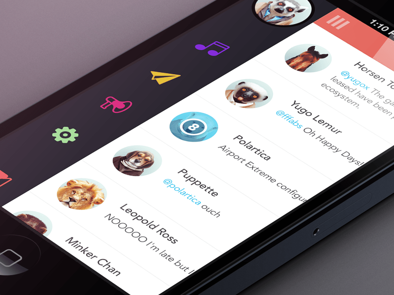
With the likes of Firefox OS (Boot to Gecko), Chrome OS and now Ubuntu for phones — an OS that makes “Web apps” first-class citizens — delivering native app-like experiences on the Web may become a necessity if users begin to expect it. Many in our field have argued for a degree of separation between the Web and native platforms for both technical and philosophical reasons. They’re certainly wise to heed caution, but as consumer devices continue to blur the boundaries, it’s worth thinking about what we can learn from native app design.
In this article, I’ll be walking through a build demo that centers on two topics. The first is responsive design patterns that embrace the viewport and that improve content discoverability beyond the basic hyperlink; in this case, off-canvas navigation. The second is the complexities of implementing such ideas in an accessible and highly performant manner. These are two topics that I believe are at the heart of the Web’s future.
With that in mind, let’s get building.
All good things begin with a solid foundation of semantic HTML and widely supported CSS. In theory, this baseline should function as a usable experience for all browsers that visit our website. (It might also be the final experience in less-capable browsers.)
As a starting point, I’ll use a technique very similar to Aaron Gustafson’s “Smart Mobile Navigation Without Hacks.” It requires no JavaScript to function.
You could consider the HTML alone, with little to no styling, as being “breakpoint zero.” If it’s not logical at this stage, then accessibility will not improve. Media queries are based on a viewport width of 45em (that’s content-dependent). Above this breakpoint, the navigation is permanently visible. I prefer em units because they allow breakpoints to maintain a relationship with text size. Lyza Gardner explains in detail in her post “The EMs Have It: Proportional Media Queries FTW!” I’m using both min-width and max-width media queries to scope CSS. This adds a bit of complexity. Most people prefer a “mobile-first” build, using only progressively larger min-width queries. The downside with that technique is the amount of resetting required if an element has noticeably different visual states. Neither method is right or wrong.
The crux of this initial stage is the :target pseudo-class selector, utilized to show and hide the navigation. Only IE8 and lower lack support. However, this is a non-issue if you serve a semi-fluid desktop style sheet to old IEs. Jake Archibald, Nicolas Gallagher and Stuart Robson can tell you more.
As the demo takes shape, I’ll continue to introduce the main development principles. There’s a long way to go yet…
For some websites, the above may suffice — but not for us! We’re experimenting with off-canvas patterns and striving for that native experience. Because we cannot ignore older browsers, it’s now time to progressively enhance. I’m adding the class js-ready to the document element after the DOMContentLoaded event fires. The selector .js-ready is used as a hook to safely restyle the navigation off-canvas. If for whatever reason JavaScript doesn’t load, then the original functionality from demo 1 still exists.
To show and hide the navigation, I’m toggling a class of js-nav on the document element when the user clicks (or taps) the relevant buttons. This simply applies a style of left: 70% to the #inner-wrap element (#outer-wrap is used to hide any overflow and to avoid scrollbars).
This is a fairly basic enhancement, but importantly it remains usable before JavaScript is ready. It’s also notable that no inline styles are written with JavaScript; only classes are used to manage states.
Jumping between open and closed navigation states makes for a jarring user experience. Users need to understand — or even see — how an interface has changed. This is often the point where developers let the Web down. To be fair, building user interfaces is incredibly difficult. What I’m going to show below is far from perfect, but it’s certainly a step in the right direction.

Sed accumsan elit ac magna tincidunt interdum eget et nisi. Pellentesque iaculis commodo aliquet. Aliquam erat volutpat. Praesent dictum est tristique justo tincidunt quis ornare turpis vestibulum. Proin quis quam vel nulla euismod cursus. Morbi pharetra consectetur dolor, id aliquam ligula ultrices eget. Vivamus et nunc at velit malesuada semper accumsan vitae elit. Duis vel neque neque. In sit amet dui vulputate mauris euismod egestas. Quisque euismod dolor a metus pharetra venenatis. Curabitur ut nisl ut sem mollis viverra. Donec bibendum massa in quam malesuada molestie. Aliquam dictum feugiat dolor porta imperdiet.
Fusce euismod, erat eu iaculis tincidunt, lectus orci ultricies leo, ornare ultricies neque tellus elementum sapien. Vestibulum at ante velit. Curabitur ut enim mi, sit amet pharetra lorem. In vitae ligula in ligula pellentesque ullamcorper. Donec posuere massa a augue dapibus sed adipiscing sapien suscipit. Etiam pretium hendrerit tincidunt. Cras ultrices fermentum sapien vitae posuere. Ut at arcu et lectus dictum condimentum vel sit amet diam. Integer nunc ipsum, malesuada a congue vitae, convallis ut nunc. Suspendisse porttitor pellentesque porttitor. Cras tristique metus posuere turpis iaculis venenatis. Integer sodales tincidunt leo non aliquam. Nulla id ante vel lacus blandit vestibulum. Praesent malesuada iaculis justo, sit amet scelerisque felis laoreet ut. Mauris ac orci sit amet massa elementum rhoncus quis nec arcu.
Donec sollicitudin, sapien eget accumsan condimentum, diam tellus interdum enim, eu sodales mauris velit quis arcu. Cras non massa vel lacus aliquet vehicula vitae at tortor. Donec sit amet nulla sit amet nibh aliquet laoreet quis quis felis. Nulla facilisi. Sed laoreet, lacus sed pulvinar lacinia, est enim gravida tortor, quis congue tellus arcu ut diam. Cras vitae quam non tellus fringilla dignissim. Phasellus vulputate pharetra dui, a pharetra sapien faucibus et. Nunc sagittis iaculis consectetur. Fusce mollis viverra ligula, eu ornare ligula pellentesque eu.
Etiam cursus lectus ut libero suscipit id fermentum sapien convallis. Sed sed iaculis eros. Maecenas interdum eleifend vestibulum. Praesent feugiat tincidunt elit vitae fermentum. Vivamus porttitor varius dolor, sit amet pulvinar diam pretium non. Etiam urna eros, cursus ac laoreet sed, rhoncus in mi. Etiam cursus nisl ac libero malesuada a consectetur diam varius. Sed aliquet bibendum ultricies. Suspendisse a mauris mi, id rutrum enim. Proin eu urna ut turpis dapibus aliquam at scelerisque sapien. Nunc eu sapien nisl, dapibus fermentum turpis. Suspendisse ligula ipsum, cursus ac pulvinar ut, lobortis vitae ante.

